|
Template App Sheets |
Scroll Previous Topic Top Next Topic More |
By default, the following sheets are available in the mpmX Template App (if configured). All sheets are self-explaining as each visualization carries a description of it's measures and dimensions. Furthermore, a guided tour helps your to navigate through the app when you start working with it.
|
Please note that a lot of visualizations in the sheets offer to switch the dimensions or measures displayed. Thus, a visualization itself can display different analysis perspectives and offer more possibilities than perceived at first sight. |

SHEET (Click on the sheet for details.) |
Short explanation |
Focus on a single activity or resource and understand it’s impact on your process. |
|
Use this sheet to easily define custom subprocesses and reveal their lead times. |
|
See the automation rate of your process and reveal its automation potential in order to improve it. |
|
Benchmark two different processes for a direct side-by-side comparison. |
|
On this sheet, you can create, edit, and export a BPMN model from the ProcessAnalyzer. Also, an imported BPMN can be shown here. |
|
Analyze the process conformance by seeing how it aligns with your defined process model. |
|
Analyze in detail a specific edge of your process and gain new insights such as ways to avoid unwanted edges. |
|
Monitor your unfinished cases and take corresponding actions. |
|
Import MasterItems defined in the backend and by the mpmX algorithms. |
|
Quickly detect the most relevant optimization potentials and navigate to the corresponding sheet to analyze the topic further. |
|
Dive into your process by filtering and narrowing down your analysis to discover additional insights. |
|
Observe the unique variants your process takes. Understand what drives your processes complexity and find out how to improve it. |
|
Analyze rework events in your process such as unwanted or repeated process steps, and ways to improve your approach. |
|
Have a look at your processes lead time and identify cases that negatively impact the lead times. You can also analyze lead times of specified sub-processes. |
Info Icon:
When analysing data, additional descriptions of the data contained in the visualisations can be stored if defined.

By clicking on the info icon, these become visible to the end user and thus help to correctly interpret the displayed data.
Hover Menu:
The hover menu can also be configured for most visualisations.
The hover menu provides the option of making additional information available within the visualisation. The following options are available to make visualisations more meaningful:
1.Title
2.Description
3.Additional Key Figures
4.Additional visualisations that are filtered based on the basic visualisation
5.Images
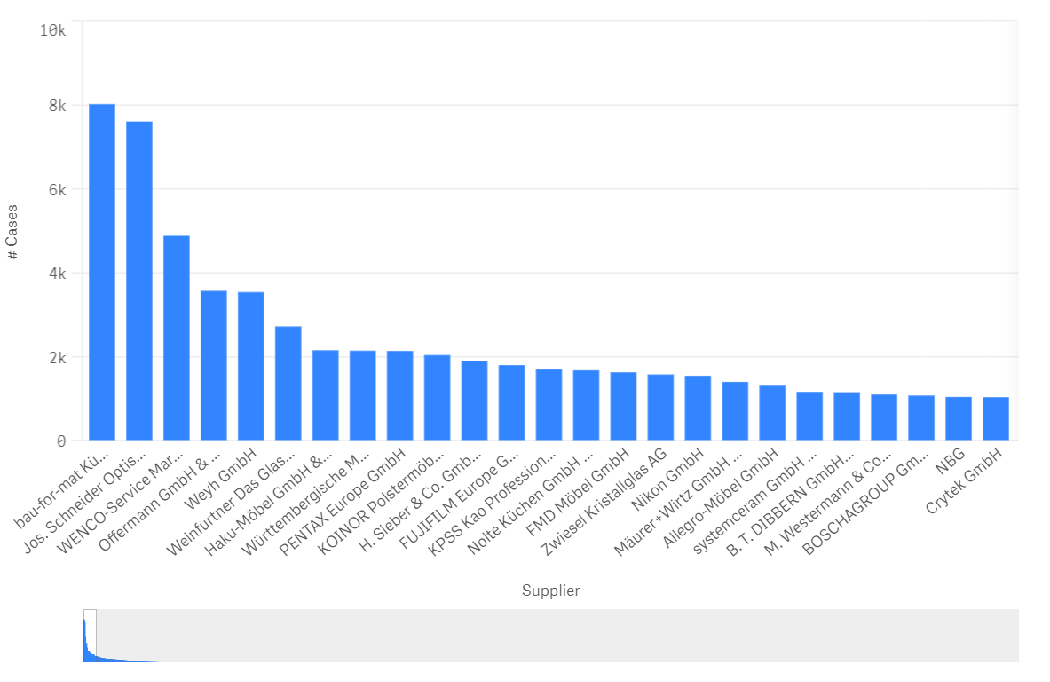
The following example shows an overview of the suppliers with the most frequent process runs in the bar chart.
By hovering over the corresponding suppliers, the end user (Business User / Analyst) is provided with additional insights:
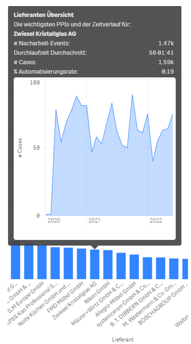
As can be seen in the screenshot, the mouse cursor was moved over the supplier "Zwiesel Kristallglas AG". The pop-up menu predefined by the business analyst now gives the end user the option of obtaining a mini supplier overview.
This enables the end user to see how much rework has taken place at the displayed supplier Zwiesel, how high the average lead time with the supplier is, and how high the automation rate is.
The integrated mini-diagram also shows how business has developed with the displayed supplier in recent years.
The customisability of the context menu means that misinterpretation of data can be counteracted and information that would otherwise have required an additional dashboard can be supplemented accordingly. This can be particularly helpful when mapping relationships that cause strong outliers but may have little relevance in the overall context. (For example, a supplier has a large number of late deliveries in percentage terms. However, by analysing the context and the course of time, it turns out that the business relationship with the supplier only began during the coronavirus crisis. It is therefore quite possible that the exceptional situation during the coronavirus pandemic has not yet been fully offset by normal business operations )
Link: If you want to know how to define the context menu of visualisations, please read here.