|
Create a Line Chart |
Scroll Previous Topic Top Next Topic More |
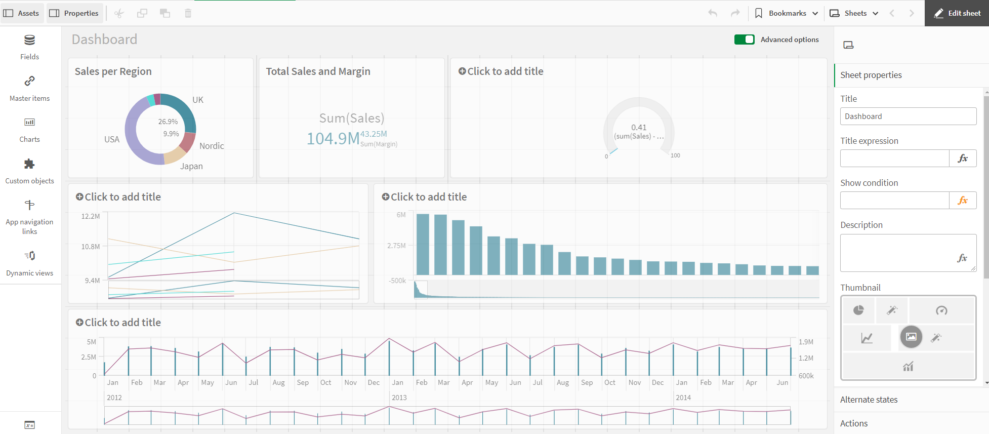
The fifth visualization is the Quarterly Trend line chart. A line chart is used to show trends over time. The dimension is always shown on the x-axis and the key figures are shown on the y-axis.
Further information can be found at Line Chart.
This line chart is used to show quarterly sales trends for the years 2012-2014. The figures for 2014 are for the first half of the year.
Proceed as follows:
1.Click on the + symbol to the right of the bar chart to add a new visualization.
2.Under Fields, click Date > Derived fields. Add Quarter and Year as dimensions.
3.Add sales as a KPI.
4.Click on the line chart icon under Properties > Visualizations.
Customize the diagrams in advanced editing mode
Once all visualizations have been created, switch to advanced editing mode to customize them. Activate Advanced options at the top right.
Dashboard - Advanced Options
Proceed as follows:
1.Select the line chart.
2.Activate the Show data points checkbox under Appearance > Presentation.
3.Click on the chart and add a title: Quarterly Trends.