|
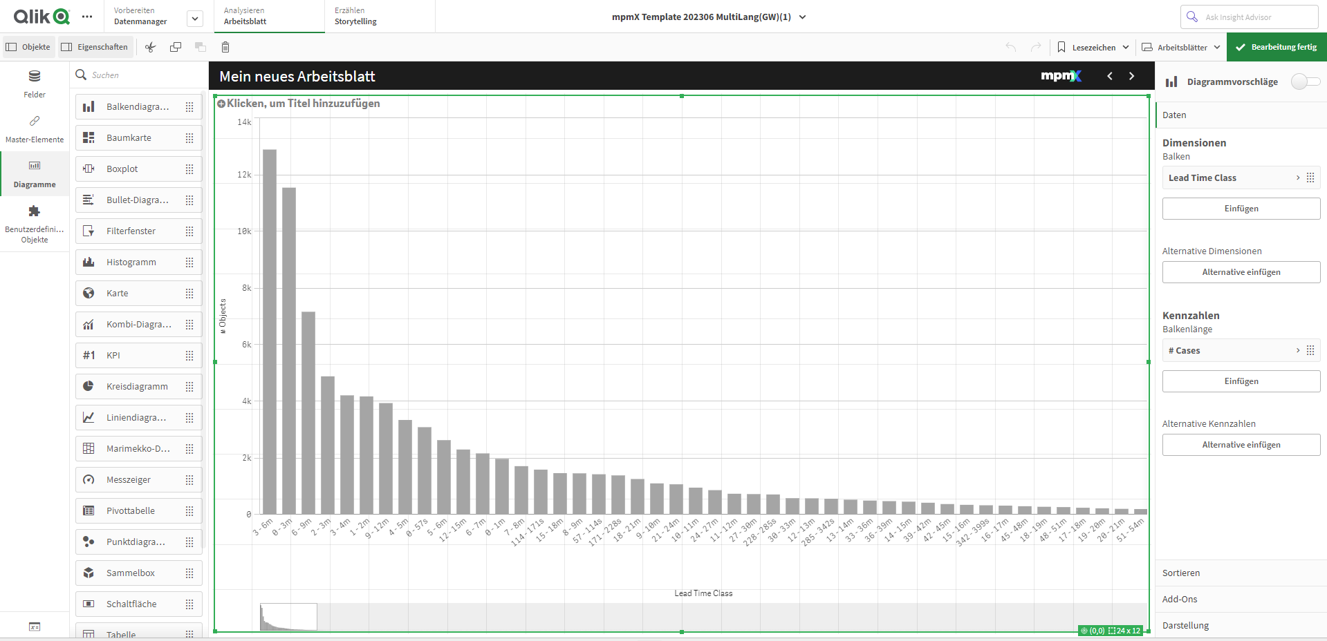
Create a Bar Chart |
Scroll Previous Topic Top Next Topic More |
The next visualization is a bar chart with the five most important customers. A bar chart is suitable for comparing several values. The dimension axis shows the category items that are being compared; the measure axis shows the value for each category item. Grouping and stacking the bars makes it easy to display grouped data.
Proceed as follows:
1.Click on the + symbol below the measurement pointer diagram to add a new visualization.
2.Add Customer as the dimension and Sales as the key figure.
3.The automatic diagram creates a bar chart. You can customize this chart later in advanced editing mode.
Customize the diagrams in advanced editing mode
Once all visualizations have been created, switch to advanced editing mode to customize them. Activate Advanced options at the top right.
Dashboard - Advanced Options
Edit Bar Chart
Proceed as follows:
1.Select the bar chart and deactivate Chart suggestions.
2.Under Presentation, select the Horizontal option.
3.Select Data and click on the dimension Customer .
4.Select the Fixed number option in the Restriction drop-down menu. Enter the following in the formula field: 5.
| The diagram only shows the 5 most important customers. |
5.Deactivate the Show other checkbox.
6.Click on the diagram and add a title: Top 5 Customers
The bar chart is finished and shows the five most important customers. If you make selections in other visualizations, the customers will change accordingly.
If you had not deactivated the Show others selection, the fifth bar would have been displayed in gray and would have summarized all those sales values where the company name is missing. This value can be helpful to find out how much of the turnover cannot be related to a specific company.