|
Create a Combo Chart |
Scroll Previous Topic Top Next Topic More |
The last visualization we would like to create is the Sales Trend combo chart. The combo chart combines a bar chart and a line chart. It is useful for combining values that are normally difficult to combine due to their different scale. A typical example would be the following: You have a bar chart with sales figures and want to combine these figures with the margin values (in percent).
Proceed as follows:
1.Click on the + symbol below the line chart to add a new visualization.
2.Add Sales and Margin as key figures.
3.Under Fields, click on Date > Derived fields. Add YearMonth as a dimension.
4.Under Properties > Visualizations, click on the combo chart icon..
Customize the diagrams in advanced editing mode
Once all visualizations have been created, switch to advanced editing mode to customize them. Activate Advanced options at the top right.
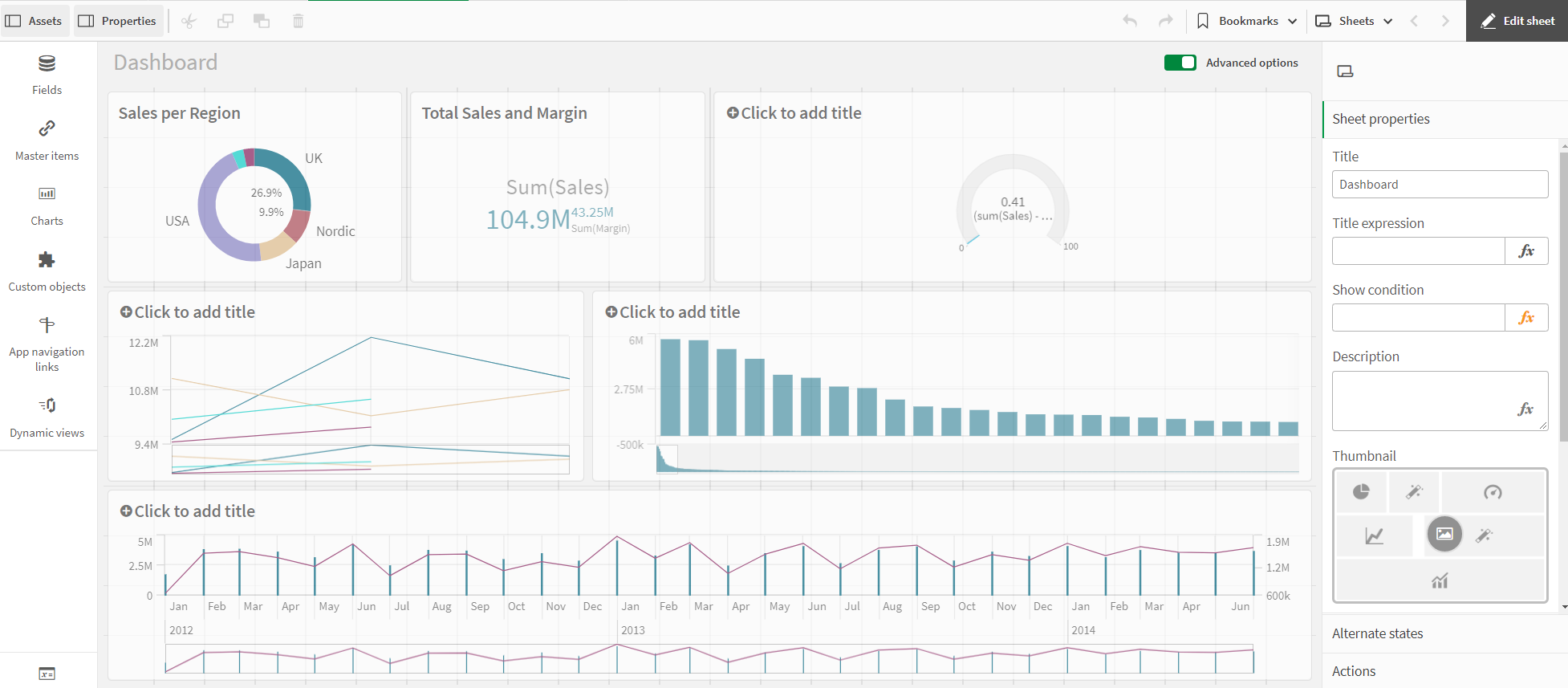
Dashboard - Advanced Options
Proceed as follows:
1.Select the combination diagram.
2.Under Colors and legend, deactivate the Show legend option.
3.Under X-axis, deactivate the option Continuous and deactivate the checkbox Use continuous scale.
4.Click on the chart and add a title: Sales Trend.
The combination chart is ready. The two key figures each have an axis. This makes it possible to combine values with completely different scales.
The primary axis on the left is used for Sales, the secondary axis on the right for Margin.