|
Create a Guage Chart |
Scroll Previous Topic Top Next Topic More |
Here we will create a Profit Margin gauge chart. A gauge can be used to visualize a single key figure. A gauge is easy to read and understand and provides an instant indication of performance within a range.
This time we'll add a formula to calculate the profit margin.
Proceed as follows:
1.Click on the + icon to the right of the KPI chart to add a new visualization.
2.Under Properties > Visualizations, click on the menu icon (three dots). Then click on the measurement pointer icon.
3.Click on Add KPI and then on the formula icon fx.
| The formula editor opens. |
4.Enter the following:
(sum(Sales) - sum(Cost)) / Sum (Sales)
5.Click on Apply.
Customizing the diagrams in advanced editing mode
Once all visualizations have been created, switch to advanced editing mode to customize them. Activate Advanced options at the top right.
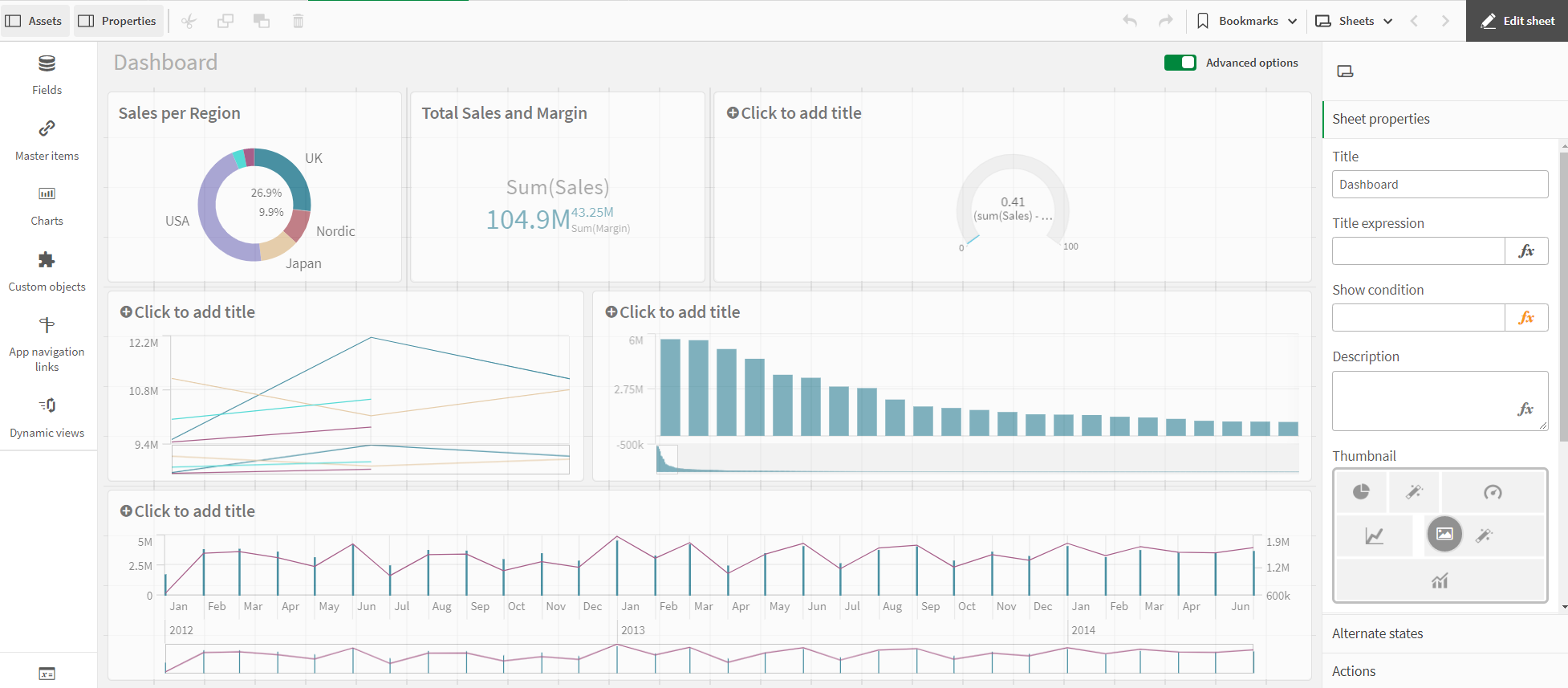
Dashboard - Advanced Options
Proceed as follows:
1.Select the gauge chart.
2.Deactivate chart suggestions.
3.Under Presentation > Range limits, set the minimum value to -0.5 and the maximum value to 0.5.
4.Select the Bar option.
5.Activate Use segments and deactivate Use library.
6.Click on the Add limit button. Enter 0.12 in the field.
7.Click on the Value bar. Select red for the values below the limit and green for the values above the limit.
8.Select Data. Click on the formula to display further options. Under Number format, select Number from the drop-down menu. Under Simple, select the 12% option.
| This will display a percentage without decimals. |
9.Select Appearance > KPI axis. From the Field Names and Titles drop-down menu, select Field Names Only.
10.Click on the chart and add a title: Profit Margin.
The gauge is ready and shows a large profit margin.
The different colors of the gauge are used to support the interpretation of the value. Red is worrying, green is good.