|
Create a KPI Tile |
Scroll Previous Topic Top Next Topic More |
Here we will create a KPI tile for Total Sales and Margin. A KPI visualization displays one or two key figures and is used to track performance. Color coding and icons show the relationship of the numbers to the expected results.
For more information, see KPI.
Proceed as follows:
1.Click the + icon to the right of the pie chart to add a new visualization.
2.Under Fields, drag the option Sales as KPI.
This automatically creates the KPI chart.
3.Add Margin as a second KPI.
4.Under Presentation, select the option Labels and add a title: Total Sales and Margin.
Customize the charts in advanced edit mode
Once all visualizations have been created, switch to advanced editing mode to customize them. Activate Advanced options at the top right.
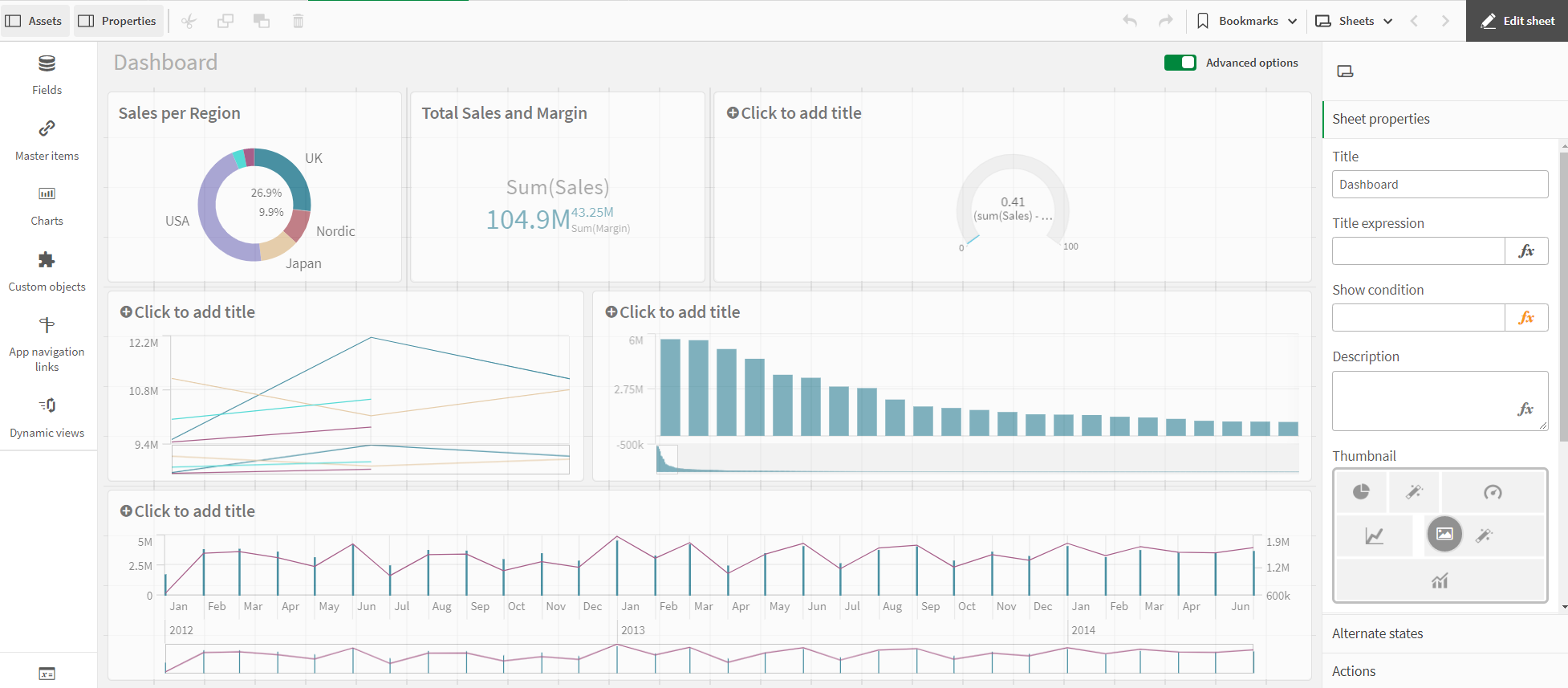
Dashboard - Advanced Options
Proceed as follows:
1.Select the KPI chart.
2.Go to KPI on the right.
3.Click on "Sales". The KPI is expanded and displays further options. Enter the term Sales under Name.
4.Click on "Margin". The KPI is expanded and displays further options. Enter the term Margin under Description.
5.Deactivate chart suggestions.
6.Select the Color option under Display. Make sure that First is selected. Deactivate Conditional colors and Library colors. Then select a red color from the color palette.
7.Select Second. Deactivate Library colors. Then select a green color from the color palette.
The KPI is complete and shows that total sales are below expectations, but the margin is still sufficient.
The different colors and symbols are used to support the interpretation of the value. Red is worrying, green is good.