|
Adjusting colors of Charts and other Visualizations |
Scroll Previous Topic Top Next Topic More |
Here is how you adjust the colors of charts and visualizations:
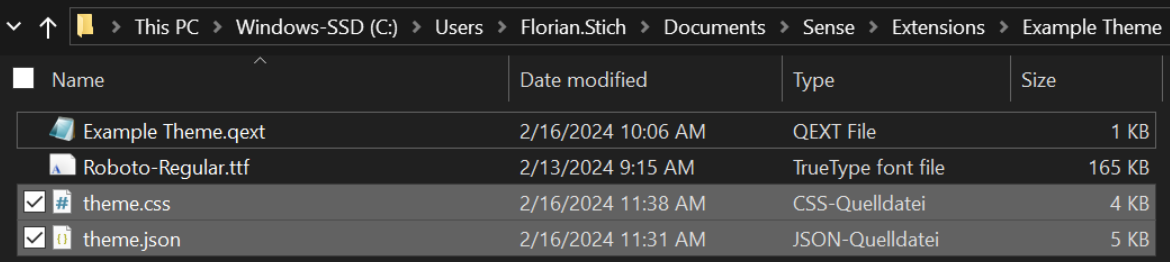
1.In the css and json file, several color codes can be replaced with your corporate colors:
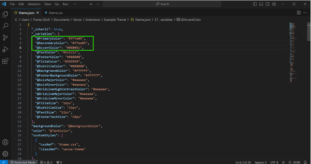
2.Json file: In this Example Theme, the hex codes for the primary color (orange), the secondary color (yellow) and the accent color (dark blue) were adapted:
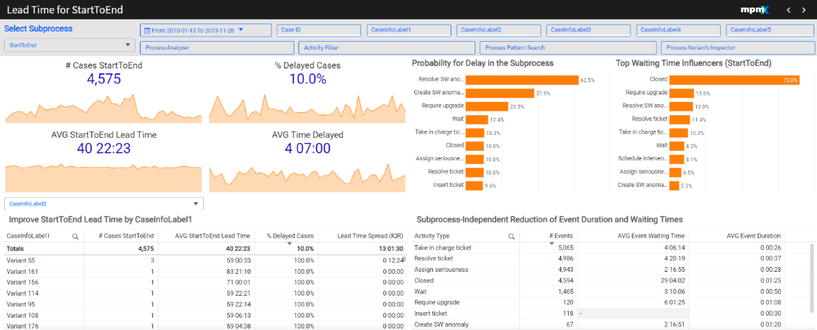
The result looks like this:
Further variables can be adapted to your needs:
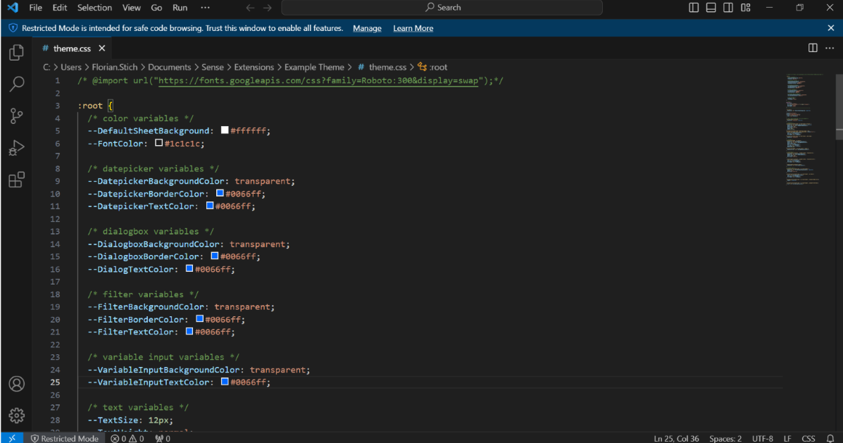
1.Css file: In this Example Theme, the text and border colors of date picker, variable input, dialogbox and filter objects were changed to blue:
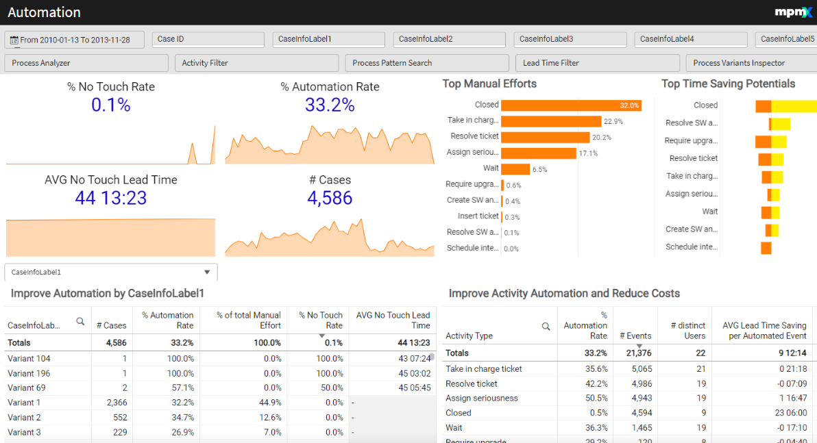
The result looks like this: