|
Create a Pie Chart |
Scroll Previous Topic Top Next Topic More |
Pie charts and ring charts show the relationship between different values as well as the relationship of a single value to the total value. You can use a pie chart if you have a single data series with only positive values. Use a ring chart if you have a single data series that contains negative values.
For more information see Pie Chart and Donut Chart.
Proceed as follows:
1.Go to Fields and drag the Sales field onto the worksheet, where you drop it on the Drop field to use as measure tile.
2.Drag the Region field onto the worksheet and drop it on the Drop field to use as dimension tile.
3.The automatic chart creates a table. Under Properties > Visualizations, click on the pie chart icon.
4.Under Presentation, select the option Labels and add a title: Sales per region.
Customizing the charts in advanced editing mode
Once all visualizations have been created, switch to advanced editing mode to customize them. Activate Advanced options at the top right.
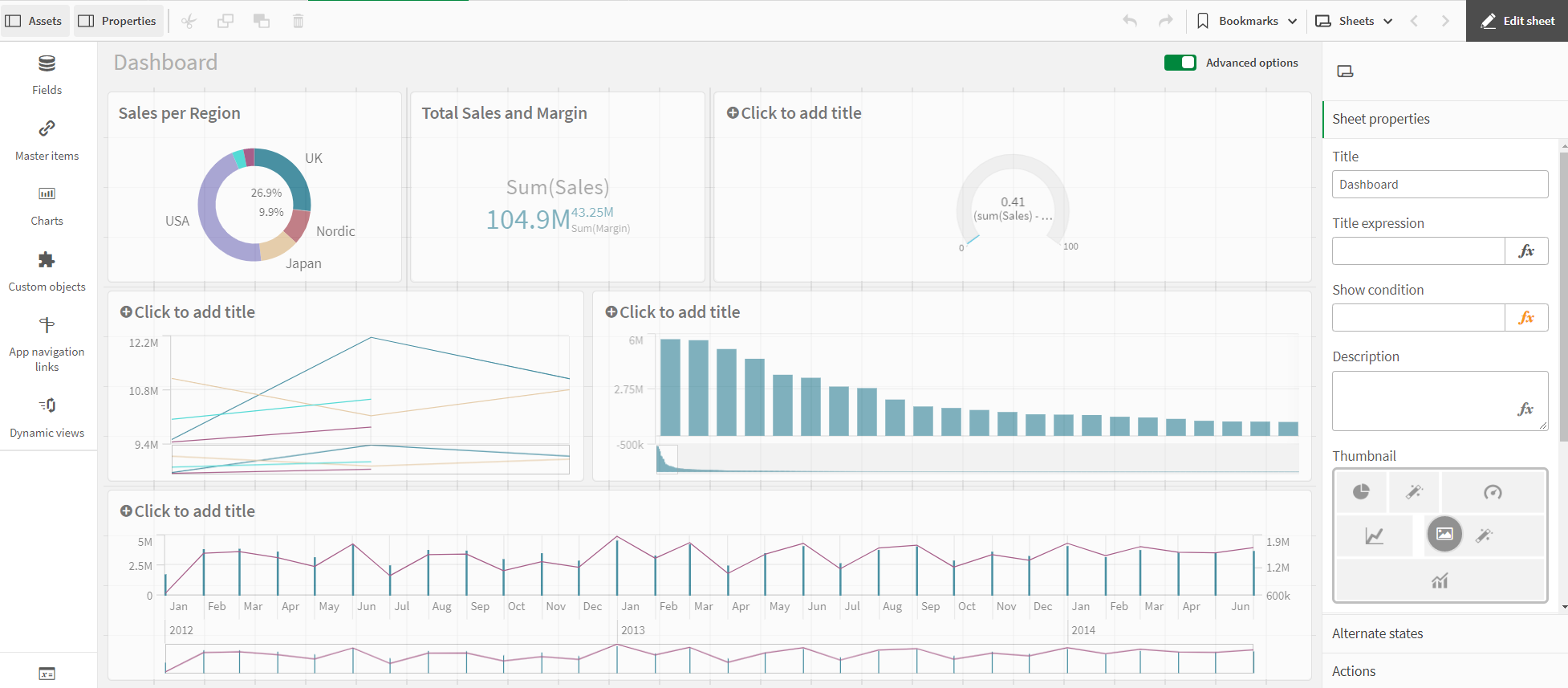
Dashboard - Advanced Options
Proceed as follows:
1.Select the ring chart.
2.Click on Colors and Legend on the right.
3.Deactivate Automatic colors. Under Custom, click the drop-down menu and select By metric.
4.Deactivate Show legend.
The ring chart is ready. The color of the ring chart is displayed by key figure: the higher the value, the darker the color.
You have many options for the color display of the values. However, you should remember that colors have a specific purpose and should not just be used to make the visualization more colourful.